 Dear Friends and Readers–The second book in the Compass Crimes Series needs cover art. The wonderful cover artists at Damonza.com have sent three gorgeous choices and I can’t decide which to use. Help! Would you take a moment to vote of which of the choices you find the most interesting and representative of the story North of the Killing Hand? This is the second book in the Compass Crimes Series and it is a finalist in the Royal Palm Literary Award Competition. North of the Killing Hand debuts in trade paperback and eBook on October 16. The first book in the series was South of Justice.
When book covers appear on Amazon and Barnes & Noble and iBooks the images are small, so first impressions matter. For marketing, the covers maintain a similarity of style. Each story can stand alone, but the characters overlap from one story to the next. The Compass Crimes Series combines the elements of the women’s fiction genre, the crime genre, and the suspense genre. You can read the beginning of North of the Killing Hand by clicking here. And this is the back cover copy for the story:
After Nefi Jenkins witnesses her parents’ murder in Brazil, she bonds with her American rescuers. They bring her to the U.S. to live with her relatives where she must adapt to a radically different lifestyle. She dedicates her life to law enforcement, in large part to impress Vincent Gunnerson, one of her rescuers. Meanwhile, her parents’ killer tracks her down, forcing Nefi to choose between the rule of law and the temptation of revenge.
The story takes place deep in the Amazon jungle in Brazil, then in a major U.S. city.
Please cast your votes by listing the covers by letter in the order of your favorite to your least favorite. If you have a minute to explain why you like your favorite, that helps too! Which cover begs you to pick it up and peek inside?
Cover A

Cover B

Cover C
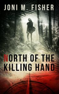
Thank you for your votes!
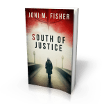
Thank you so much for making South of Justice a success! Every copy sold and every review feels like a hug to this debut author.
In order of preference: A, B, C
My vote is cover “B” ! I don’t know what it is but it draws me in.
I can’t wait for North of the Killing Hand to arrive!
I think I vote for A,but likeC C also
I have to go with ‘B’ it’s spooky with the fog rolling through the trees 🙂
‘A’ next, same reason, the fog on the deserted street.
‘C’ is my least favorite- too busy
Good luck, the book sounds great!
I like cover A as it is the most striking. I like that she is wearing a trench coat as it gives that aura of mystery. Also her outline is much sharper and the feeling comes through stronger.
Hands down is A.
I like cover a but they are all great. Looking forward to release.
I choose A,C, and B! Can’t wait to read them!!!
HI! I like A because it is similar to the first cover and it could be a recurring theme, but I like B because it is spooky as someone else posted and it does get away from what your first cover was with the lady walking away. Cant wait to read it!!!!
Joni,
I like “A” but I like the compass of “C”. Why I chose A is that the figure is way more compelling than the figure in C. A is walking into trouble. C is running away.
Rosemarie
I’ll have to go with “C”. It’s thought provoking in the styling.
love A
A–first choice. It looks spoky. B second C last.
I am inclined to choose C, but I don’t know why.
I really like A, but the figure is off-center. I’d like it better if she were directly above the compass needle like in the other two. If that were fixed, it would be my preferred choice. Given that, I like C, which hearkens to the Brazil jungle feeling, since that’s where the killing takes place. I also like the more intense redness of it.
I like “A” the best. It looks to be the most fitting for the title of the book as I see it. And, it must have been high on someones list to be at the top of the choices and the “A” choice as well. So, I’m inclined to go with it.
B,A,C I like the fog on B. Too much distraction on A and C.
After 35 plus years in the printing industry, here’s my opinion. All the graphics are great, BUT none of the covers showcase your title. If you go with either A or C, I’d ask your designer to clear the clutter around the title. If you go with cover B, ask them to lighten the gray background around the title. Graphics shouldn’t obscure the title, especially when sizing down for thumbprints on phones or other media.
I like A. But think the women should be centered like the other 2. All great choices. Congrats Joni.
Hey Joni! I like A. It’s brighter & pulls me in…